
DC Field Trip
- gkdragonet
- Dec 19, 2023
- 3 min read
NGA
Map:

The map is divided into layers to show the different levels of the building. The facilities are well labeled, and different colors/numbering systems organize the different areas of the museum. The map also shows exterior landmarks like streets and the sculpture garden. At the bottom of the map, the layers of the building and how they connect are clarified. There is also a small extra spot with a warning to not touch works of art. It wasn't difficult to pick a destination and get there by using the map. The map fulfills its purpose very well.
It is legible and uses the same fonts as those used for signs around the building. There is a lot of text on the page, so it may be too small for those with bad eyesight.
Signage and Posters:


(First to third, left to right)
The first sign is for informing readers where Leonardo da Vinci's Ginevra de' Benci is. The design suggests that Leonardo da Vinci's Ginevra de' Benci in particular is sought for more than other works. Its font is consistent with the map's and fonts used for most other signs and posters. The featured art is barely cropped. The text is underneath the image.
The second collection of posters are of different works/artists and additional information in relation to them in the museum. The font choice is consistent, and some of the images are cropped. All text is underneath the pictures other than the one on the Sculpture Garden.
The third poster is informing the viewer on the garden cafe in the NGA. The design uses an image as the entire background, showcasing the area, and the text puts emphasis on the fact that it is a garden more than anything else. The fonts used at the top are seemingly unique to this poster compared to every other poster/sign. The text is on the top and bottom of the poster.
Gift Shop Items:

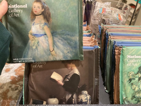


I chose the product(s) on the left because they looked like something I've never seen before. Chocolates are usually packaged with the logo for it being very prominent, but the ones in the picture display the artworks above all. The designer had to get multiple pieces of art and put them onto wrapping(s). They had to choose art that would not clash with the consistent placement of text on the bottom and top left corners. They had to put in text that was big enough to read, but still small enough to leave room for the featured art to be shown.
I chose the product on the left because the designer implimented a 2D piece of art onto a 3D curved area. The designer had to find out how to fit in the text "National Gallery of Art" and the artwork onto the surface area and then print it onto the mug.
Hirshhorn
"Map":

Hirshhorn did not have a map. However, there was a sign at the escalators that showed what things were on what floors. Letters are bolded and capitalized to be headers with further information underneath. There are a few symbols used as well. This photo was taken on floor one, so the section for floor one is a different variant. Of course, actual visuals of the museum's layout are not present. Sans serif fonts are used. The text is legible. Overall, the design feels minimalistic. Since Hirshhorn is a cylindrical building with both vertical and horizontal layering, it could be hard to navigate. The information on this sign is useful, but maybe not useful enough.
Signage and Posters:


(First to third, left to right, top to bottom)
Although debatably not a sign or poster, the first image shows a literal wall of text. This is the first thing you see when you enter the "Purple" exhibition, and the text serves as an intro. The wall is purple and therefore on theme. The lengthy text shows that the exhibition will not have further explaining about the author. The font is consistent with other fonts used in this museum. There is a small thumbnail for a video at the bottom that can be scanned to be viewed.
The second picture is of a sign next to a collection of displayed photos. Its format is standard and the design is simple and legible. The font used is consistent with other fonts used in this museum.
The third picture is yet again text on a wall(featuring Parker and Samuel). Rather than direct information, it is a quote, likely to inspire/intrigue those who see it. The font used is consistent with other fonts used in this museum.
Gift Shop Items:


I took photos of these products because I recognized the featured artworks. The designers had to take the original piece(s) and create patterns that could be applied to a variety of things. For the badges and shirt in the photo on the right, the designer(s) had to take a 3D piece of art and apply it to a 2D surface while still being recognizable as the original.


Comments